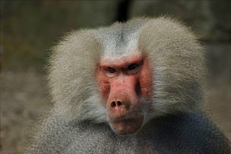
Long story short, this method is using the image/photo as a background image of a div element. Then we implement border-radius to circle-clip the particular div element.I have a charming looking baboon here. This is from Wikimedia Commons.
This method can be applied for non-square/square sized image.
To get "properly centered" image, we need to put the background-position, background-size, and the div element dimensions correctly.
That wasn't short, right?
I re-sized it to
720px x 480px (desktop).On mobile view, it has
max-width of 100%. The img element, not the div which will be using the background-image.This is an
img element
Now, I want to make the baboon has a circle canvas - like profile photo you saw on Google Plus.This is the (
div) result
CSS HTML
Then I want to make it like it was taken from an iPhone, or something similar. So, I'll put a lil box-shadow on it.Looks like this
CSS HTML
Probably the image is too big. Let's make it smaller, by re-sizing the background-size, followed by tinkering the size of box-shadows. Then let's put CSS photo filter effect on it.CSS HTML Result
Use latest Chrome or Firefox to see the photo filter effect
The circle-clipping is all because of the
border-radius property. We can omit the overflow:hidden and the background will still be cropped.
Why?
Because overflow property is applied for element inside the <div> tag (or any other HTML tag you're using). In the examples above, I don't have any element in the <div> tag. The image is as background of the <div> element. I put it there so that if you want to put another image or text inside the <div>, it (or they - the other element) will fit properly.If you want to use this method for your blog post or website author photo, just change the URL-of-image with your image's URL. Then you can adjust the background positioning, the size, and the
box-shadow (inset and default).For responsive
div element with custom background-image, we can also use JavaScript or use only CSS and really tinker it, so that the particular element fits relative to the current window size.
With this CSS3 color filter, we don't have to use offline photo editor to apply basic color filter. It's a fascinating CSS property.
Update
January 21, 2015
The latest version of Firefox (35.0) now supports CSS3 color filter
developer.mozilla.org/en-US/docs/Web/CSS/filter#Browser_compatibility
Hooray for Firefox developers!
Hip hip!
Using inline CSS for the
img elementWe can also apply direct inline styling to an image. BUT, to make a perfect circle, we must have a square image (same height and width). For instance, that Mr. Baboon picture above, this what will happen if I put direct inline styling:
So, on that example above, which is oval shaped, I included style='border-radius:50%' in the <img> element. Not a perfect circle because the image isn't a square sized one.
The image element with inline CSS:
A tool
This is a tool you can use on Port Raptor
Wanna say hi to Mr. Baboon?
Let's go to Mr. Baboon's place
No comments:
Post a Comment
Tell me what you think...